Typeface Croak
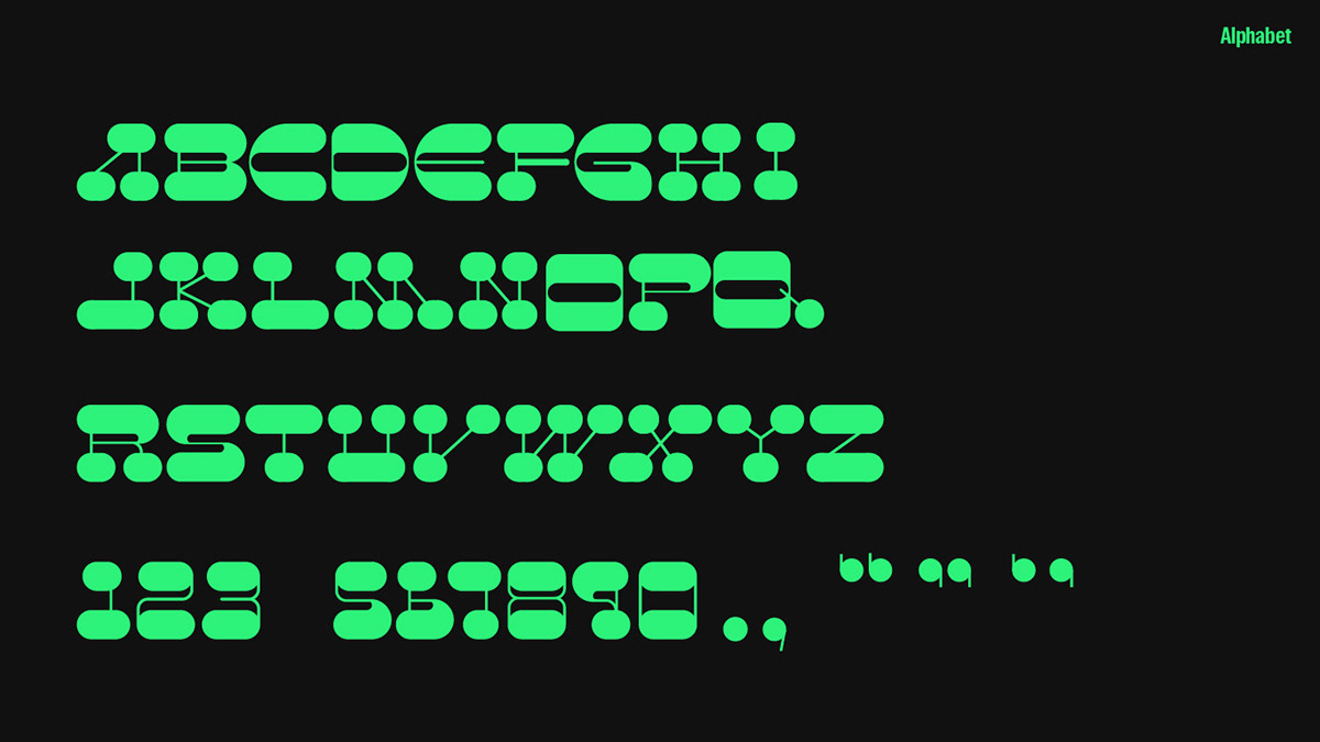
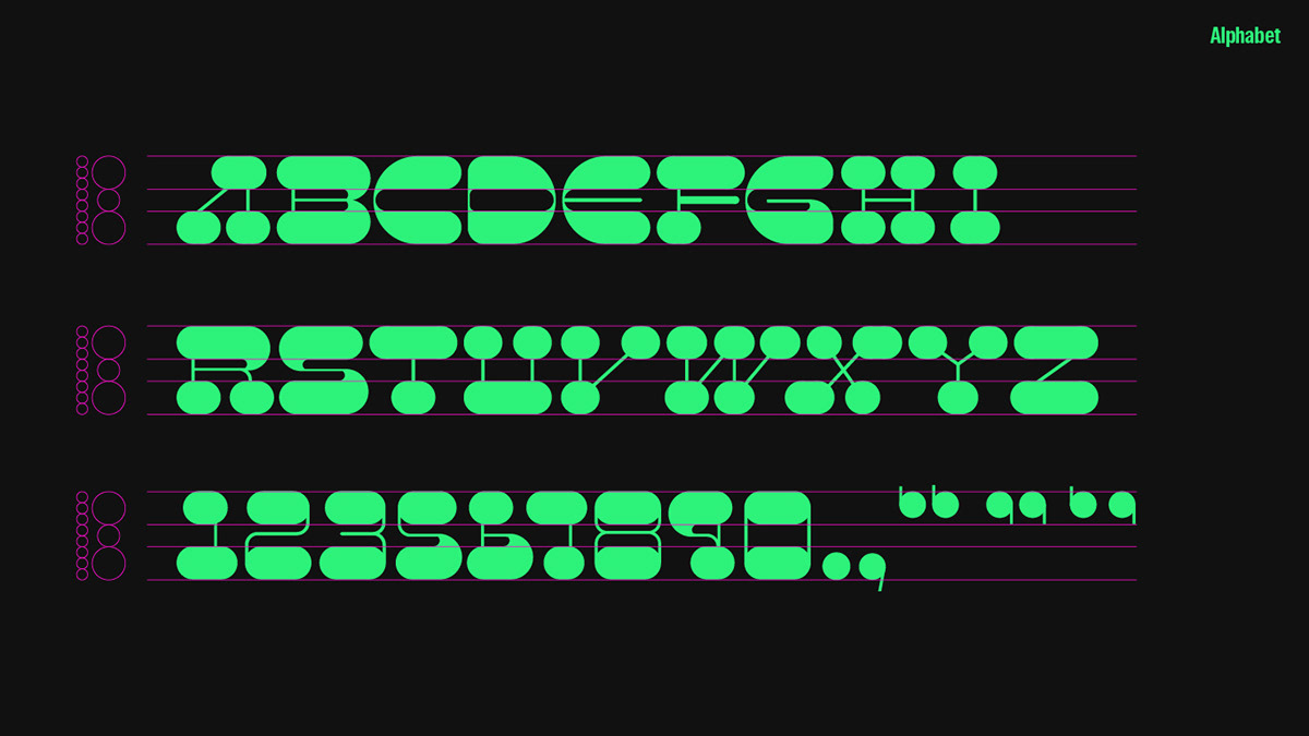
Typeface Croak is obtained a graphic motif from the frog, the representative element of stirring of insects. Among the appearances of frogs, it is a display font that uses the shape of the round circle of the frog's feet as the main feature. The characteristics of the serif were further developed from the existing slab serif typeface. When the letters were arranged, the round shape seen from the serif was regularly repeated to try to give the impression of a pattern. In addition, the horizontal elements of the serif of the typeface are emphasized, and the vertical strokes are laid thinly, and the sense of contrast felt vertically and horizontally is another fun of this typeface.Most of the typefaces were created mainly for vertical feeling, but M, V, W, and X gave a little tilt to give visual fun. The main rule is that there is no bracket like the characteristics of the existing slab serifs, but letters with a lot of curves such as G, C, S, and O are designed to connect the pillars and serifs more naturally through the bracket.